
If it’s a menu guide on how to order a hamburger you are looking for, then you are in the wrong place. Apart from jokes, there are no beef patties covered in cheese and surrounded in buns here because we are going to be giving a guide on the user interface (UI) tool that we call the hamburger menu.
Used right, the hamburger menu can be an incredibly helpful tool for your business website. However, using it incorrectly can hinder instead of helping your clients. Below is our guide on everything you need to know about the hamburger menu and how you can use it.
What is the hamburger menu?
Travelling back to the 1980s, designer Norm Cox created the hamburger menu as a UI element for the Xerox Star personal workstation. It was four vertical lines above each other that when clicked, opened a list of items.
Fast forward to where we are today and it has become one of the most known UI elements on websites and applications. It’s popularity greatly rose with the increase of mobile technology that has less space on the screen for bulky UI menus. Today the hamburger menu no longer has four lines, but three lines instead and it is typically placed at the top left or right side of a screen.
These useful icons are used to open navigation menus for websites and applications allowing a clean UI and smooth user experience (UX). While the original has been changed slightly since the 80s, the hamburger menu remains one of the most well-known UI elements today.

The rise of mobile-first design.
Since the burst of mobile technology, the hamburger menu has become increasingly popular. This is because screen real estate is very limited on smaller screens. It didn’t take very long for Google to rank mobile-friendly websites higher either which means traditional websites soon adopted the hamburger menu too. Apart from mobile real estate and search engine optimisation (SEO), the hamburger menu has many other reasons why you might want to use it. In the rest of this guide, we will go over why you would want to or not want to use the hamburger menu and how you can implement it into your business website.
Why you should use the hamburger menu.

It is widely recognised.
The purpose of the hamburger menu is almost always understood. The understanding also grows with every generation, so it’s a long-lasting symbol too. This is because the purpose of the hamburger menu has never changed, so it avoids all the confusion could have when faced with a new UI.
Clean and focused design.
In a world where less can mean more, the hamburger menu reigns supreme. With only three lines, that can be as simple as you want, there is no cleaner place to put a menu. This allows your brand’s website design to put the focus on more important products, images or other navigation features.

Instant and direct access.
There is no second-guessing as to what will happen when you click in the hamburger menu and it can give access to every feature your website has to offer. When used right, this can mean less searching and fewer clicks for your clients. This improves UX which in turn will improve your conversion rates.
Why you should not use the hamburger menu.
Hiding features.
When something is out of sight, it can become out of mind. A hamburger menu will hide features on your website behind the three lines. When hidden in this way, users will automatically assume that those features are less important. This will hinder click through rates and can hurt your UX.

Everybody doesn’t know.
While remaining one of the most recognisable UI elements, there are still some people who will not. When your client first lands on your website, they will immediately look for what they can do. They want to find the navigation tools, but if they are hidden behind a hamburger menu, your client may leave.
Requires more steps.
While some features may be quicker to access through a hamburger menu, others won’t be. When a key feature on your website is hiding behind a hamburger menu, it will mean your clients need to make an extra click to get to where they want to be. This reduces the effectiveness of your UX because it is more difficult to reach.
The guide to using the hamburger menu.
As you have seen, there are several pros and cons to the hamburger menu. Sometimes the pros outweigh the cons and other times, cons can be avoided with cleaver UI design. If you have decided the hamburger menu is for you or you just want to learn more, we will now discuss how you can use the hamburger menu and its best practises.
When to use the hamburger menu.
If your website has several features, some more important than others, then putting the secondary features behind a hamburger menu can be a good idea to avoid clutter. In this case, the extra click will save your client from having to search the landing page for what they want.
Having a cluttered screen can seriously hinder your UX and your clients will be turned away. It’s important to not overload the landing page and limit the navigation that your client can do. This is where hamburger menus are perfect. They can hide features that are not core to the importance of your website while keeping the additional navigation optional in a neat and easy to read space. This is particularly helpful when the screen real estate is limited.
When designing a responsive website, a hamburger menu for smaller screens but a more traditional menu for bigger screens can be the perfect in-between. This option is fantastic when your business website’s UI is strong but difficult to navigate on mobile devices. If this is how you wish to implement the hamburger menu, then be sure that the mobile version still carries the same core message with the menu hidden.
Where to put the Hamburger menu.
The rule of thumb for the position of a hamburger menu is at the top right corner of the screen. This is typically the easiest to access position that doesn’t clash with pre-existing UI. The latter becomes a concern when your client is using an iOS device where there is already a navigational button. This clash can cause misclicks that will result in a bad UX.
The floating hamburger menu.

If your clients use mobile devices more than desktop, the floating hamburger menu could be a fantastic answer. It is typically placed at the bottom right corner of the screen and will hover over what is displayed. This will place importance on its existence and be very close to a mobile user’s reach.
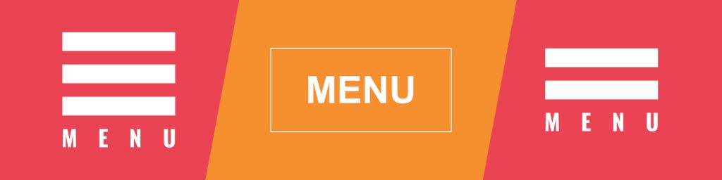
Using words is a good alternative.
MENU – It doesn’t take up much space and puts its intent in words. While a hamburger menu can be a brilliant solution to UI design, words can convey the message even clearer. If you know that your clients have the chance of not understanding the hamburger menu, then you can use the word or a combination of both.
Create the perfect UI for you and your clients with Web2Web.
With good UI comes good client engagements. This will boost your website’s traffic and increase your conversions. This is why it is so important to get the UI of your brand’s website right. When building a website with Web2Web, you will get a design and development team that knows exactly how to make the UI perfect for your brand and your clients. Getting started is simple too, contact us if you are starting a new website or want to update an already existing one to support your business goals.