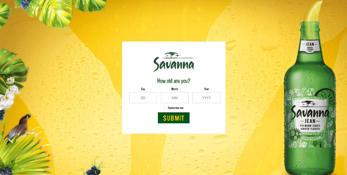
What is a splash page? As the first page that a client will see when visiting your website, it is like the welcome mat in front of a house. As a very unique website element, it can boost website engagement, email signups and a whole lot more.
In this article, we are going to give an in-depth answer to the question ‘what is a splash page?’, what goes into one and some tips on how to make your own a success.
What is a splash page?
A splash page acts as an introductory screen that your clients will see when they visit your brand’s website. Think about it like the lobby to your home page that will greet your clients and take their details. While it does add an extra step for your clients to get to your landing page, used correctly it can boost your branding and marketing. With good design, it can even impress your clients and encourage them to engage with your brand even more.
Most importantly, this page can get your clients to do something before they enter your home page. These goals can include:
- Sign-ups to an emailer.
- Collect contact details.
- Ask for age verification.
- Display a disclaimer.
- Promote your next event.
- Highlight a product.
These are just a handful of examples, the list can continue depending on what your company’s goals are.
What is the difference between a splash and a landing page?
We now know that a splash page is the first page a client will see when loading your website, but isn’t that what a landing page is?
The two can be easily confused because their purposes do have overlapping goals. However, they are two very different pages on your website with different functions.
A landing page is a standalone page created specifically with conversion in mind. The navigation is minimal and doesn’t want the viewer to leave until they have converted.
A splash page on the other hand is attached to your home page and has a clear exit link to take the viewer to the main site. With the goals that we have discussed in the previous section, you can see how these two types of pages are very different.

What goes on a splash page?
Before we even begin putting elements on the web page, we need to go back to the goals. What is the purpose of the splash page and what do you want to get from it? If you can’t answer that question, then your website probably doesn’t need a splash page. If you can answer the question, what you put on this page will vary depending on the goal.
There are still three basics that every splash page should have.
- Strong visuals
- Impactful copy
- Easy exit

Strong visuals.
There few better places to wow your clients than on your splash page. With the perfect image, you can achieve just that. This will catch their attention and create an impactful first impression on your website while representing your brand.
This image could be a background, product or even a video. Just be sure to also include your logo to avoid people from feeling lost.
Impactful copy.
Every splash page has a purpose and it’s vital that the viewer knows what that purpose is. Keep the copy short, impactful and action-oriented. With a concise message that tells the viewer what to do, your splash page will fulfil its goal perfectly.
This is also the perfect place to introduce the tone and personality of your brand. Keep the copy in line with your website and your clients will enjoy engaging with your splash page.
Easy exit.
No matter what you want to get from your clients on your splash page, its primary goal is to welcome them to your website. This means that the way to navigate away from this page to your home page must be incredibly obvious.
Sometimes, the goal you have for this page is the exit. Liquor stores are perfect examples of this. They need to confirm the age of the user before the home page can show, so submitting your age is what leads the user to the home page.

Tips to help you make your splash pages.
Visual hierarchy.
Visuals are a huge element to splash pages, so considering the size and placement of each element is important. Make sure that everything not only works together but that it is fluid and effective to support the goal.
Fast loading time.
We all know that the loading speed of your website is important, but it is especially so on your splash page. It is an extra step in between your client’s goal and as such, any amount of resistance needs to be removed. Fortunately, a splash page typically doesn’t contain loads of big elements. Make sure they are optimised and your splash page will have a good loading speed.
Social media accounts.
If your company has a social media account, and it should, the splash page is the perfect place to put them. This is a very modest way to remind your clients to follow you while informing them where they can get even more of your brand. These elements should not be very dominant on the page.
MAKE THE PERFECT FIRST IMPRESSION ON YOUR WEBSITE WITH WEB2WEB.
Your website is your company’s store font online and visitors, virtual customers. Even most of your physical store visits will have searched for your brand online before walking through your door. This is why it is so essential for your website to represent your brand accurately and make the best first impression. This is where Web2Web comes in. We can create, refresh or update your business website so that it can support your goals and boost your online success.
Make your website create the best first impression, contact us today.

